
Back to All Case Studies
RWD
Search
IA
Website
Public Sector

Finding the right clinical specialist
RB&HH NHS Trust needed a redesigned digital experience to better connect patients and private referrals with specialist cardiovascular and respiratory care.
Timeline
2 Months
Scope
Responsive website redesign • search and Information Architecture
Role
Sole UX/UI Designer
Team
2 Developers, 1 Project Manager
CHALLENGE
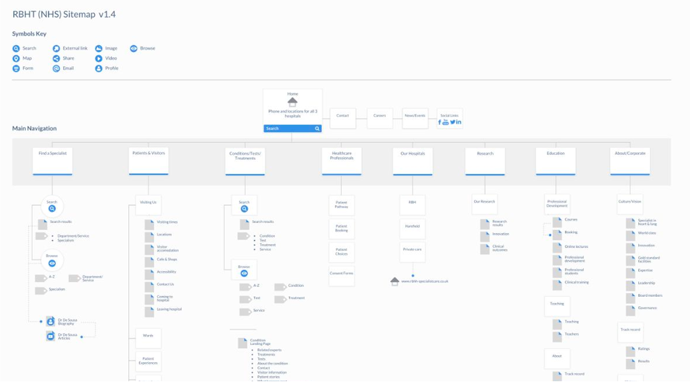
Trust's existing website was outdated, difficult to navigate, and failed to reflect its prestigious status. Two of the key areas, “Specialists” and “Conditions” were disjointed and difficult to navigate.
- Patients struggling to find the right consultant
- Drop-offs in private care enquiries
- Missed revenue opportunities
- Reduced trust in a world-class institution
As sole UX/UI designer, I worked with the team to redesign the specialist and conditions search experience to improve find-ability, helping patients connect with the right specialists, understand care pathways, and access support.
RESEARCH

Interviewed patients and family onsite
Patient and family interviews revealed how people searched for specialists and highlighted key frustrations that shaped our findings.
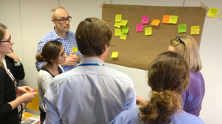
Internal workshops with doctors, nurses and stakeholders
Workshops with doctors, nurses, and admin staff uncovered pain points in daily workflows and informed the findings that follow.
Website audit
A full audit of the existing website highlighted usability issues, outdated content, and gaps in accessibility that guided our findings.
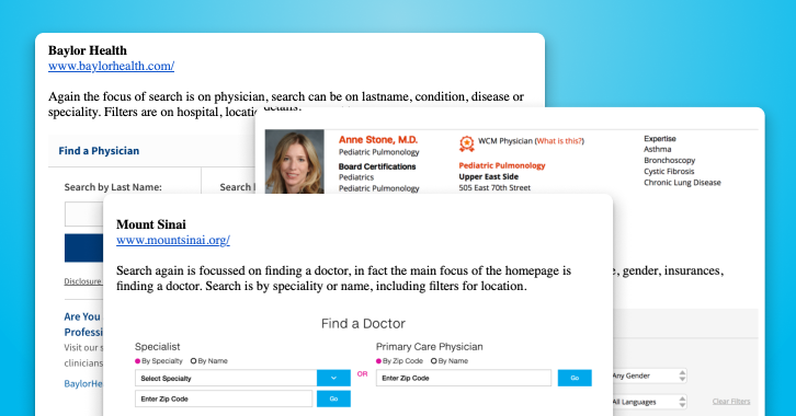
Competitor analysis
I ran a heuristic analysis on competitor websites, focusing on search and information architecture, showing how other hospitals structured content and highlighting opportunities to improve our own.
Observations
Users weren’t just browsing specialists. They were anxious and often searching under stress.
Analytics + stakeholder feedback showed:
• Users bounced when they couldn’t immediately identify relevance.
• Search terms varied widely (condition-first, name-first, symptom-first).
💡 Key Insight
Patients searching for doctors were anxious and often searching under stress, they needed the simplest search with the least cognitive load.
Recommendations
Design a unified, flexible search experience that:

Supports name, condition, and specialty in one input
Clearly signals expertise areas
Has clear relations across specialist and conditions
Mobile-first and confidence-driven
Simple to use to support the varied user types
Implementation
Unified Specialist Search Tool
• Single smart search input
• Filters by condition, specialty, consultant name
• Auto-suggestions for common conditions
• Mobile-optimized layout
Condition-Led Navigation
Reworked condition pages to:
- Explain care pathways clearly
- Link directly to relevant specialists
- Provide reassurance messaging
- Surface private enquiry options naturally
Collaboration
Worked closely with:
- 2 developers (feasibility + performance)
- PM (stakeholder alignment)
- Private care team (enquiry drop-off insights)
I translated stakeholder needs into structured UX decisions — not just visual changes.
DESIGN
Designing for Patients
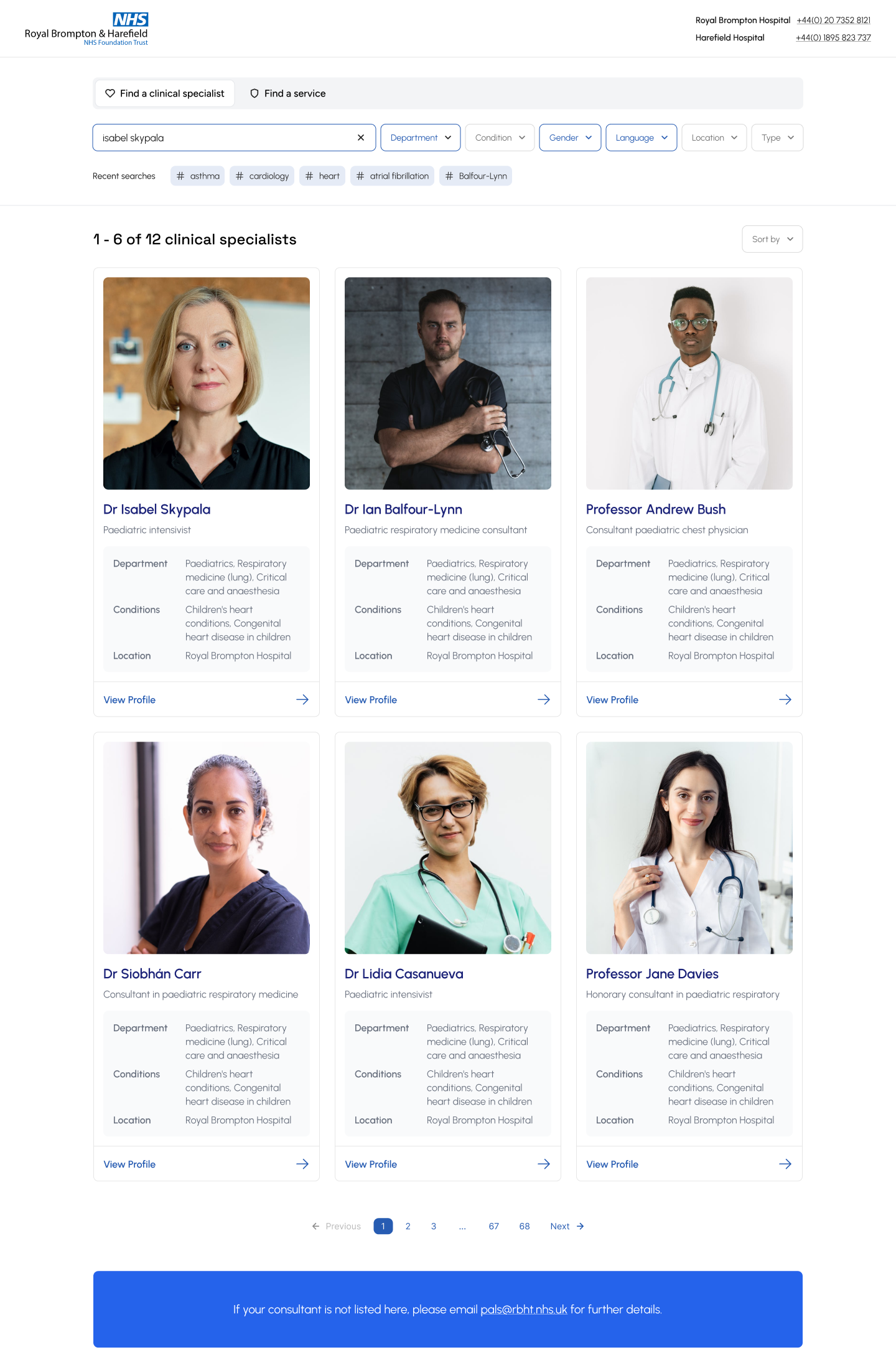
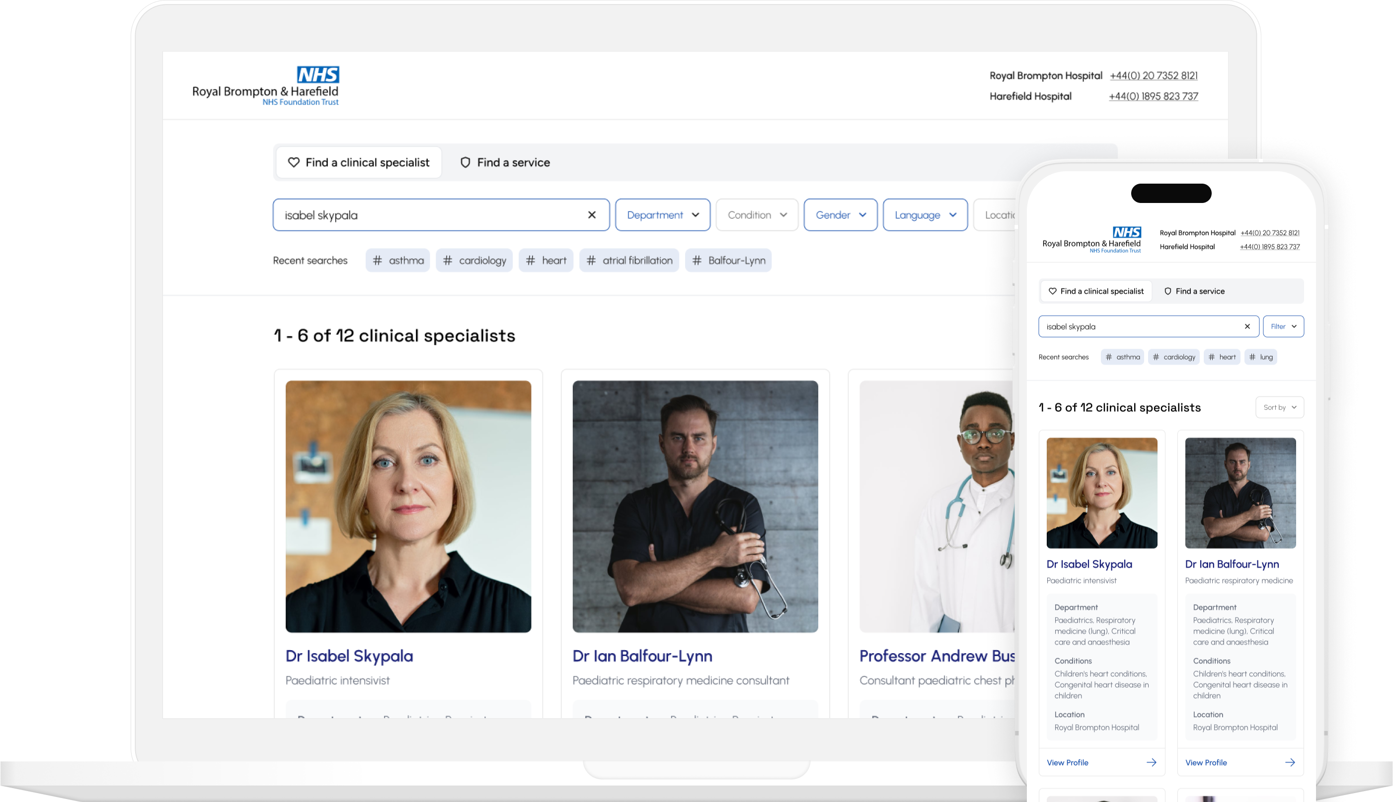
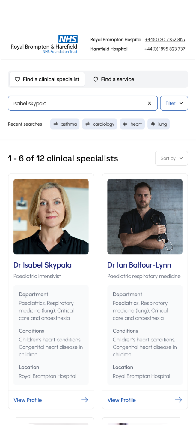
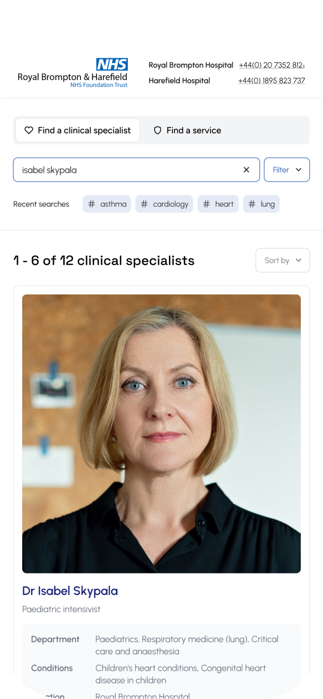
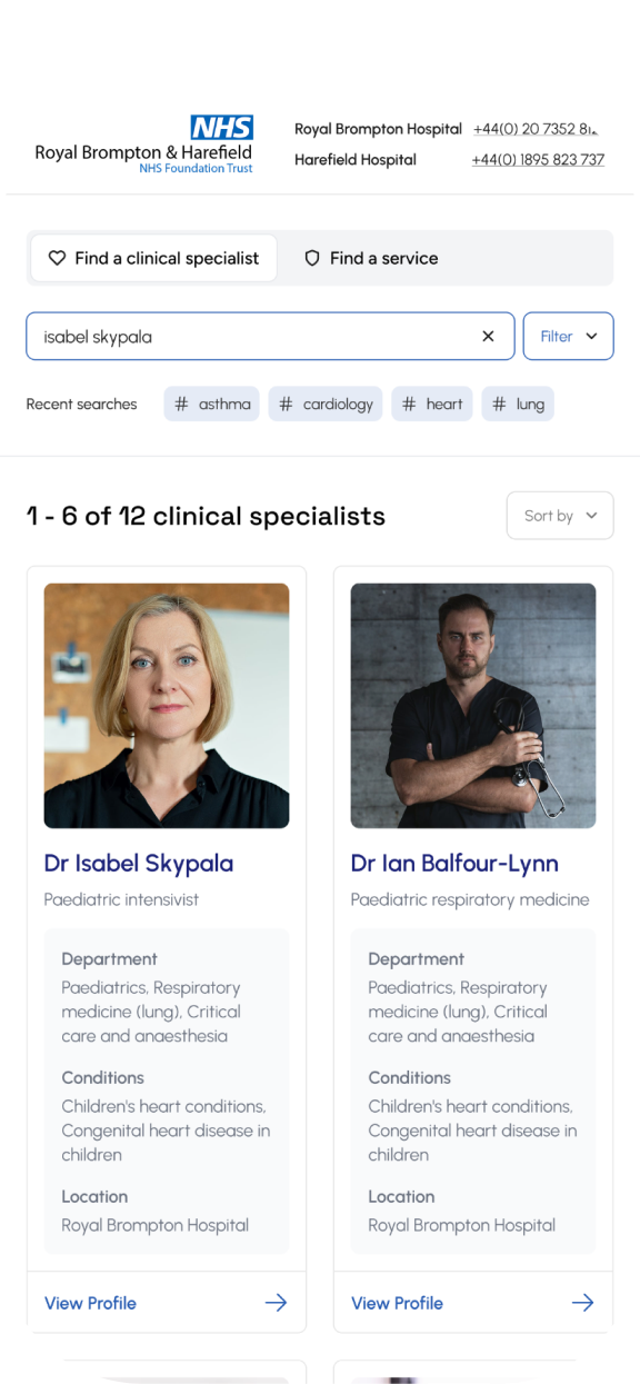
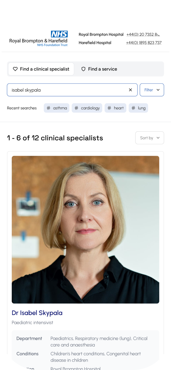
Search by consultant name, specialism, condition, symptoms or department. This gave users multiple ways of finding the right specialist.
Filtering allowed users to specify further by selecting specialty, gender, language spoken, availability, and location (e.g. main hospital vs. private hospital).
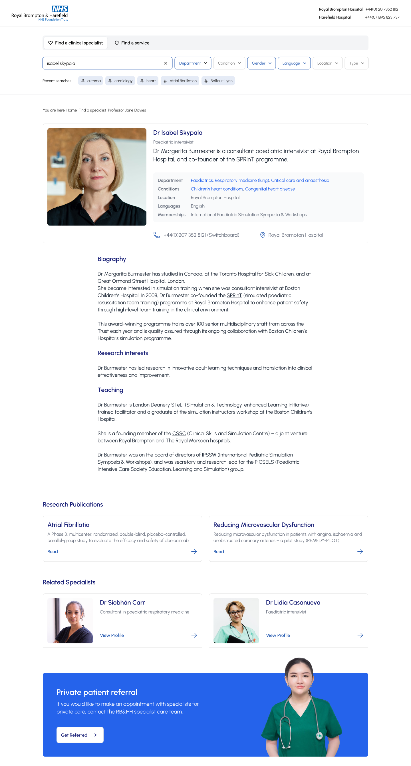
Patients could quickly scan consultant profiles to see expertise, credentials, reviews, languages, and availability. From there they could book an appointment or request a call-back, with related consultants suggested if their first choice was unavailable.
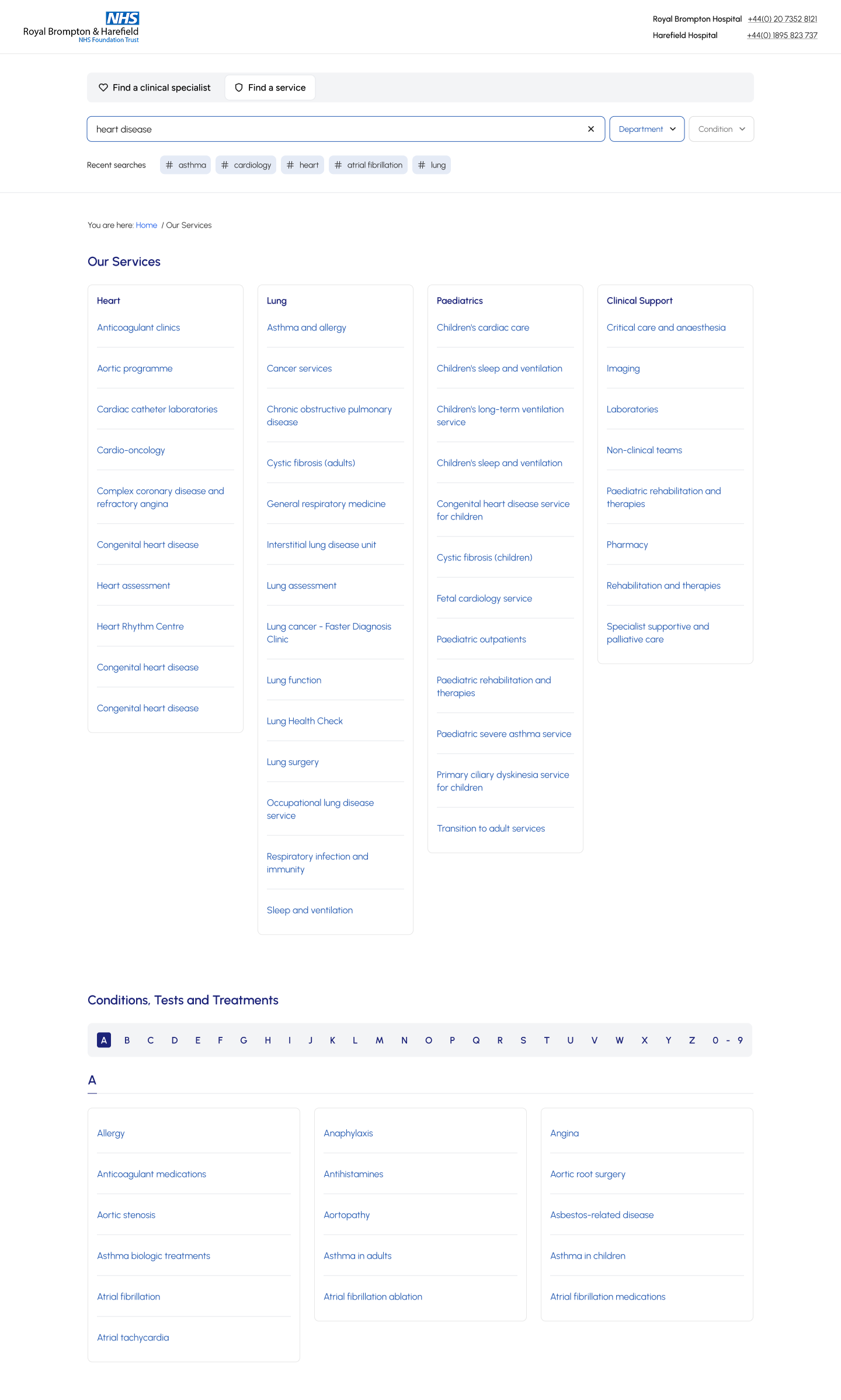
The conditions index provides a complete directory of all conditions, treatments and services available at the Trust. It’s designed to help patients, families and healthcare professionals quickly find clear, reliable information about specific health conditions and explore the treatments offered.
I designed the Conditions and Diagnosis page to highlight the hospitals’ expertise in heart and lung care, making it easy for patients to find information, understand care pathways, and access support for their specific condition.
VALIDATION
User testing
We ran several rounds of usability testing with high-fidelity wireframes, both remote and in person. Patient feedback showed that the search needed clearer entry points and more intuitive filters to narrow results, while staff highlighted the value of related information appearing alongside consultant profiles.
Stakeholder alignment
Regular reviews with the NHS steering group and private care team ensured alignment with both NHS and commercial goals.
results
Faster, relevant results
Users could quickly find the right consultant by name, specialty, or treated condition through a unified, mobile-friendly search tool.
How we know
On-site user testing showed a 40% faster time-to-result, with patients reporting less confusion when matching conditions to specialists.
Why it matters
Faster, clearer search reduced patient frustration and improved access to care, supporting both patient satisfaction and private care bookings.
Increased consultant enquries
Hospital enquiries for private consultants increased as patients were able to connect more easily with the right specialist.
How we know
Analytics showed a rise in completed consultant enquiries after launch, supported by feedback from the private care team noting fewer drop-offs in the enquiry process.
Why it matters
More successful enquiries strengthened the hospital’s private care revenue stream while building trust in the service’s ability to match patients with the right expertise.
Reflections
This project was a great learning opportunity, particularly in terms of designing for a complex stakeholder environment and handling the governance challenges that come with healthcare institutions. Key takeaways included:
By conducting patient interviews and on-site testing, we ensured the redesign addressed real user concerns.
Working with doctors, nurses, developers, and other stakeholders reinforced the value of a collaborative approach to designing complex, multi-user websites.
Next Steps
Unfortunately, the scope of the project didn’t allow us to fully explore or implement solutions for some of the underlying administrative challenges patients faced, particularly around appointment coordination and real-time communication.
I would have loved the opportunity to delve deeper into this area, especially to prototype and test some of the ideas our team had around improving administrative workflows and reducing friction for both patients and hospital staff.
Ready to explore more work?
Discover other case studies or get in touch to discuss your project.
Back to All Case Studies
RWD
Search
IA
Website
Public Sector
Finding the right clinical specialist
RB&HH NHS Trust needed a redesigned digital experience to better connect patients and private referrals with specialist cardiovascular and respiratory care.
Timeline
2 Months
Scope
Responsive website redesign • search and Information Architecture
Role
Sole UX/UI Designer
Team
2 Developers, 1 Project Manager
CHALLENGE
Trust's existing website was outdated, difficult to navigate, and failed to reflect its prestigious status. Two of the key areas, “Specialists” and “Conditions” were disjointed and difficult to navigate.
- Patients struggling to find the right consultant
- Drop-offs in private care enquiries
- Missed revenue opportunities
- Reduced trust in a world-class institution
As sole UX/UI designer, I worked with the team to redesign the specialist and conditions search experience to improve find-ability, helping patients connect with the right specialists, understand care pathways, and access support.
RESEARCH
Interviewed patients and family onsite
Patient and family interviews revealed how people searched for specialists and highlighted key frustrations that shaped our findings.
Internal workshops with doctors, nurses and stakeholders
Workshops with doctors, nurses, and admin staff uncovered pain points in daily workflows and informed the findings that follow.
Website audit
A full audit of the existing website highlighted usability issues, outdated content, and gaps in accessibility that guided our findings.
Competitor analysis
I ran a heuristic analysis on competitor websites, focusing on search and information architecture, showing how other hospitals structured content and highlighting opportunities to improve our own.
Observations
Users weren’t just browsing specialists. They were anxious and often searching under stress.
Analytics + stakeholder feedback showed:
• Users bounced when they couldn’t immediately identify relevance.
• Search terms varied widely (condition-first, name-first, symptom-first).
💡 Key Insight
Patients searching for doctors were anxious and often searching under stress, they needed the simplest search with the least cognitive load.
Recommendations
Design a unified, flexible search experience that:
Supports name, condition, and specialty in one input
Clearly signals expertise areas
Has clear relations across specialist and conditions
Mobile-first and confidence-driven
Simple to use to support the varied user types
Implementation
Unified Specialist Search Tool
• Single smart search input
• Filters by condition, specialty, consultant name
• Auto-suggestions for common conditions
• Mobile-optimized layout
Condition-Led Navigation
Reworked condition pages to:
- Explain care pathways clearly
- Link directly to relevant specialists
- Provide reassurance messaging
- Surface private enquiry options naturally
Collaboration
Worked closely with:
- 2 developers (feasibility + performance)
- PM (stakeholder alignment)
- Private care team (enquiry drop-off insights)
I translated stakeholder needs into structured UX decisions — not just visual changes.
DESIGN
Designing for Patients
Search by consultant name, specialism, condition, symptoms or department. This gave users multiple ways of finding the right specialist.
Filtering allowed users to specify further by selecting specialty, gender, language spoken, availability, and location (e.g. main hospital vs. private hospital).
Patients could quickly scan consultant profiles to see expertise, credentials, reviews, languages, and availability. From there they could book an appointment or request a call-back, with related consultants suggested if their first choice was unavailable.
The conditions index provides a complete directory of all conditions, treatments and services available at the Trust. It’s designed to help patients, families and healthcare professionals quickly find clear, reliable information about specific health conditions and explore the treatments offered.
I designed the Conditions and Diagnosis page to highlight the hospitals’ expertise in heart and lung care, making it easy for patients to find information, understand care pathways, and access support for their specific condition.
VALIDATION
User testing
We ran several rounds of usability testing with high-fidelity wireframes, both remote and in person. Patient feedback showed that the search needed clearer entry points and more intuitive filters to narrow results, while staff highlighted the value of related information appearing alongside consultant profiles.
Stakeholder alignment
Regular reviews with the NHS steering group and private care team ensured alignment with both NHS and commercial goals.
results
Faster, relevant results
Users could quickly find the right consultant by name, specialty, or treated condition through a unified, mobile-friendly search tool.
How we know
On-site user testing showed a 40% faster time-to-result, with patients reporting less confusion when matching conditions to specialists.
Why it matters
Faster, clearer search reduced patient frustration and improved access to care, supporting both patient satisfaction and private care bookings.
Increased consultant enquries
Hospital enquiries for private consultants increased as patients were able to connect more easily with the right specialist.
How we know
Analytics showed a rise in completed consultant enquiries after launch, supported by feedback from the private care team noting fewer drop-offs in the enquiry process.
Why it matters
More successful enquiries strengthened the hospital’s private care revenue stream while building trust in the service’s ability to match patients with the right expertise.
Reflections
This project was a great learning opportunity, particularly in terms of designing for a complex stakeholder environment and handling the governance challenges that come with healthcare institutions. Key takeaways included:
By conducting patient interviews and on-site testing, we ensured the redesign addressed real user concerns.
Working with doctors, nurses, developers, and other stakeholders reinforced the value of a collaborative approach to designing complex, multi-user websites.
Next Steps
Unfortunately, the scope of the project didn’t allow us to fully explore or implement solutions for some of the underlying administrative challenges patients faced, particularly around appointment coordination and real-time communication.
I would have loved the opportunity to delve deeper into this area, especially to prototype and test some of the ideas our team had around improving administrative workflows and reducing friction for both patients and hospital staff.
Ready to explore more work?
Discover other case studies or get in touch to discuss your project.