
Back to All Case Studies
Web3
SaaS
Onboarding

Reducing Drop-Off in Onboarding
Redesigning onboarding to reduce drop-off and drive paid conversions in a complex crypto tax SaaS
Timeline
2 months
Scope
Web App • Mobile App • Onboarding • Wallet Integration
Role
Senior UX/UI Designer
Team
Product Manager • Engineering Team • Marketing
CHALLENGE
As ZenLedger scaled, users were getting lost during onboarding and wallet imports, driving high bounce rates and increasing support tickets. I redesigned the core onboarding and wallet sync flows, focusing on progress visibility, clearer system feedback, and restoring trust at every step. The result was a simplified, guided experience that helped users complete successful imports with confidence while reducing friction and support load.
Users stalled and abandoned the process
I conducted interviews with the customer service team, the closest people to customers, and gained valuable insights into issues users were facing.
- I can’t find my wallet or exchange
- Unclear process
- Where am I?
- Mobile experience broken
I analysed Google analytics and DataDog to study heat maps, review funnels, drop-offs, and rage clicks, identifying where users were failing to progress.
- Drop-off before users completed first import
- No feedback (success, error)
- Dashboard adding confusion
- Funnels displayed odd behaviour
Obstacles
The product was technically strong and feature-rich, with the team shipping constantly to keep up with changing tax rules and new blockchains. But that speed created UX debt: inconsistent patterns, unclear system states, and rising support volume caused by wallet import errors.
Under the hood, legacy code meant even small changes were slow and often required rewriting parts of the platform. Testing and iteration cycles dragged, engineering bandwidth was tight, and any redesign had to land before the next tax season. Improvements couldn’t be rolled out in one clean release. They had to be carefully sequenced and shipped incrementally, whenever developer time became available, without disrupting compliance updates or stability.
💡 Key Insight
"In crypto finance, clarity equals trust. When users can't see progress, they assume failure."
RecommendationS

Convert long tasks into step-based journeys with visible progress
Provide real-time wallet-import validation and transparent sync states
Add contextual help and success confirmations
Unify tone, iconography, and interaction language across web and mobile
DESIGN
Designing for Clarity
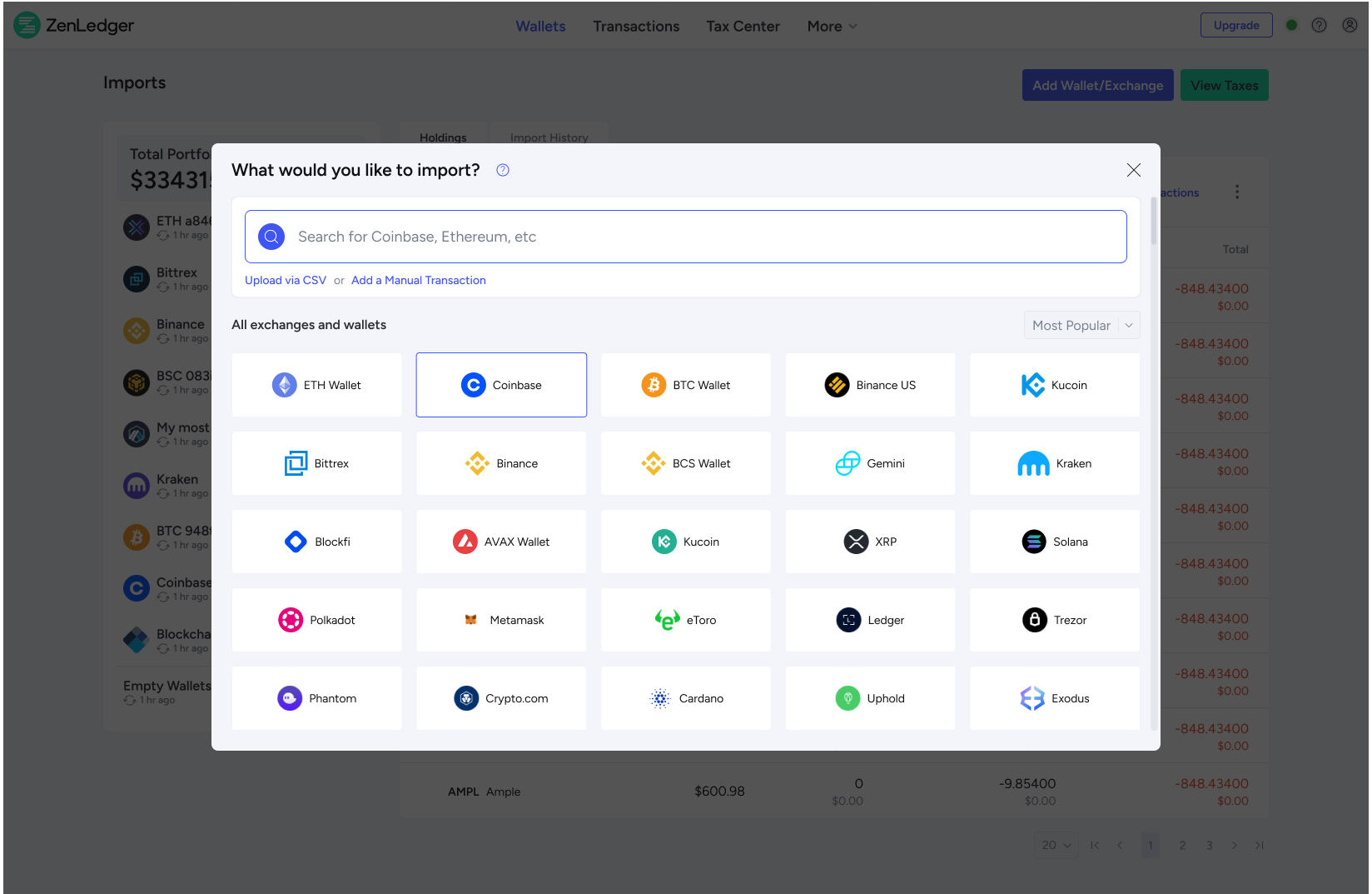
Before: Browsing or searching for wallets and exchanges to import gave the user too many decisions, forcing them to choose either, wallet, blockchain or exchange.
After: New search that allowed users to enter any phrase to search across all categories, utilising an auto suggest to quickly display results.
Before: Page based layouts meant users were switching between multiple screens losing context.
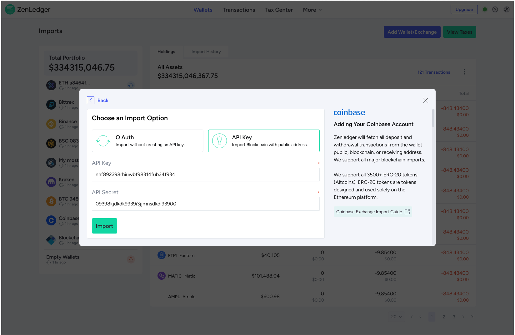
After: Replaced the page-based flow with a modal-based experience, so users could complete imports without being thrown into new contexts.
Before: Dashboard showed high amount of visits, however, bounce rates were high, heatmaps showed users mainly used it to view holdings.
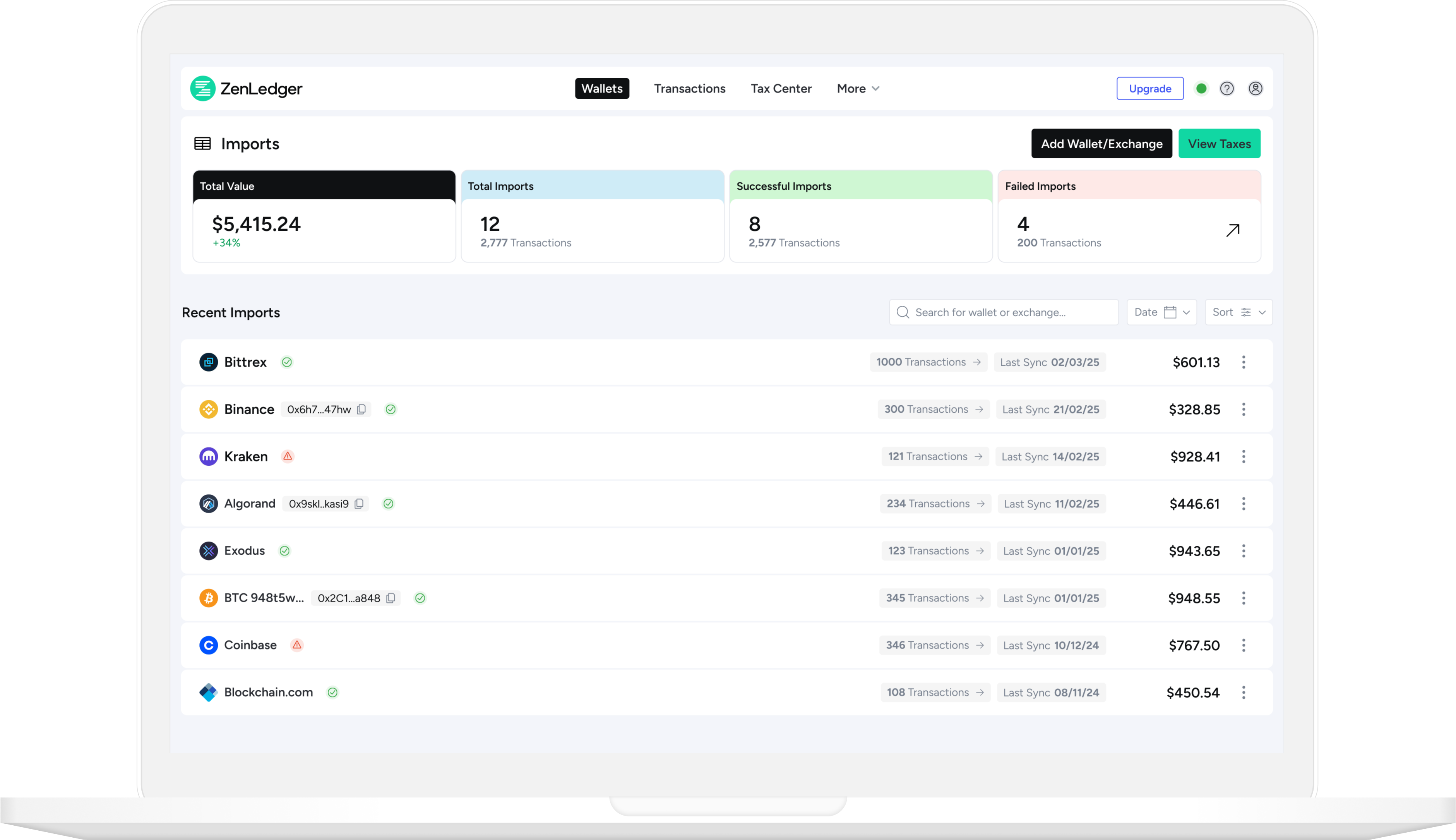
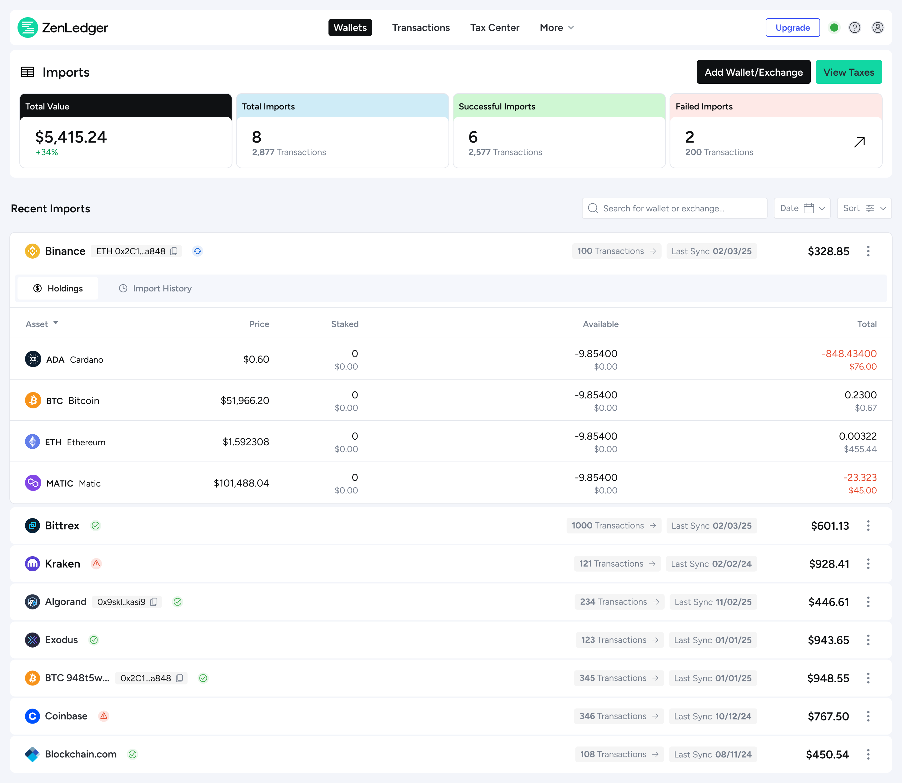
After: Consolidated Holdings and Imports into one unified view, allowing users to see progress and assets in a single place.
Before: After importing accounts, users had to continuously refresh the screen to see if their import had completed.
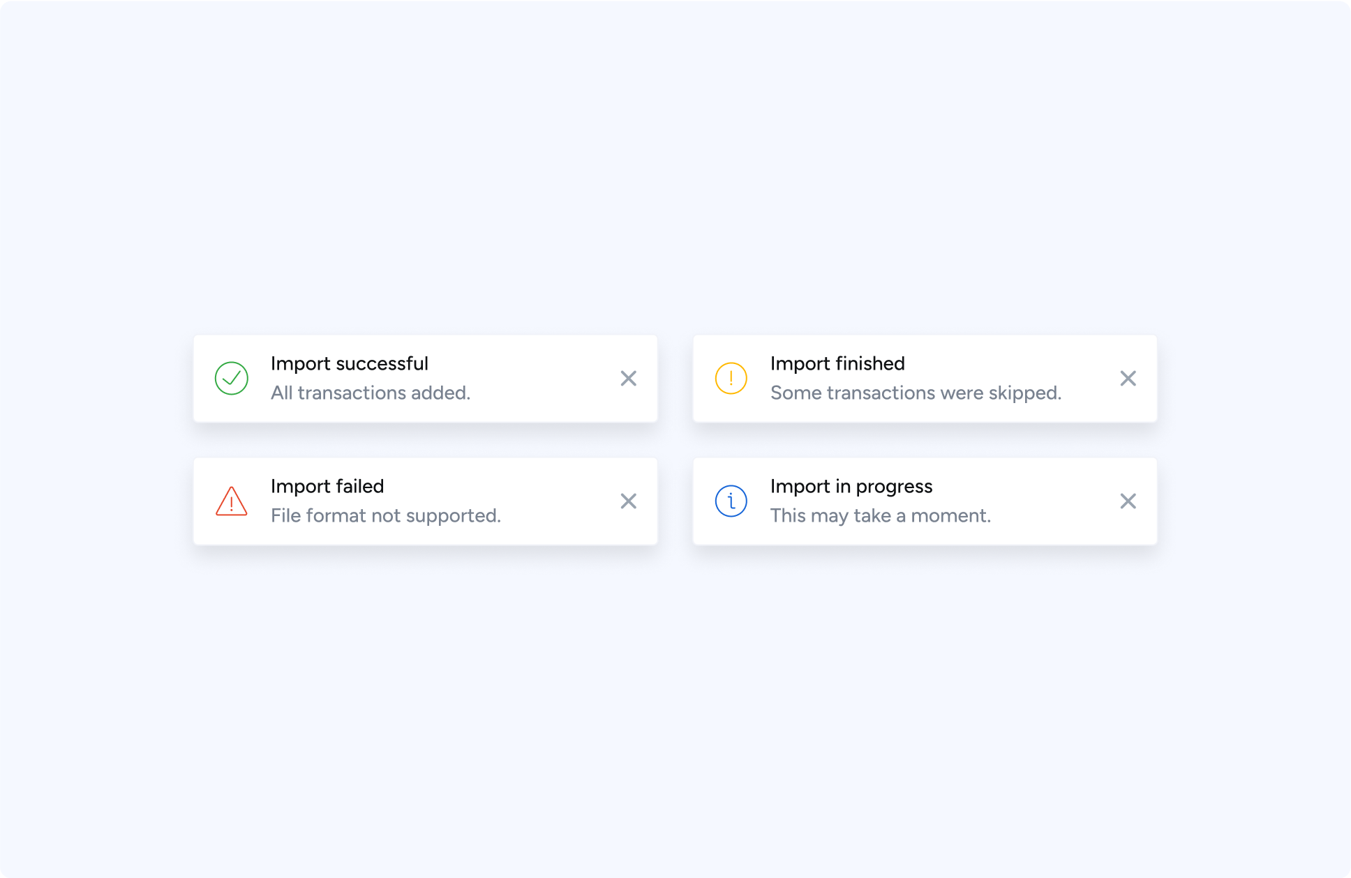
After: Added auto-refresh and real-time toast notifications to clearly show when imports were successful or if there were errors.
VALIDATION
Feedback from customer service
CS feedback: This would make it easier to support customers and solve many recurring user issues. Tested with the team, and feedback was very positive.
Validating through user testing
Real-time testing with new users on UserBrain.com showed clear improvements: uploading and sorting wallets was significantly easier.
I analysed Google analytics and DataDog to study heat maps, review funnels, drop-offs, and rage clicks, identifying where users were failing to progress.
New wallet dashboard.
RESULTS
~2x Faster wallet imports
Time-on-task data from analytics showed the process was streamlined, reducing average completion time from ~5 minutes to under 2 minutes. Quicker setup reduces drop-off and gets users to tax results sooner.
~18% Higher task completion rates
Funnel tracking in Google Analytics revealed first-time import completion increased by ~18% after launch. More users reach the point where they can see value from the product, boosting retention.
~20% Fewer support tickets
Tagged support tickets in Zendesk. “Can’t find my wallet” tickets fell by ~20% within a month. Reduces strain on support and improves user trust in the platform.
Reflections
Working on ZenLedger was a great opportunity to enhance a product at a time of significant growth. Some key takeaways include:
User-Centered Design: Direct user feedback informed every design decision, making the experience more intuitive and reducing friction.
Trust & Transparency: Trust is a critical factor in handling sensitive financial data, and improving the onboarding process helped increase user confidence.
Iterative Improvements: By making small, iterative changes and continuously testing with users, we were able to refine the flow and reduce customer support calls significantly
Next steps
Ability to import multiple blockchains at once: A valuable next step would be letting users import data from multiple blockchains in one flow, no matter the wallet or exchange. This would cut down on repetition, save time, and lower the risk of missed transactions—better matching how users actually manage their crypto.
Adding a progress stepper: Introducing a progress stepper would guide users from their first import through to downloading tax documents. It would make the process clearer, reduce uncertainty, and give users confidence that they’ve completed all steps correctly.
Ready to explore more work?
Discover other case studies or get in touch to discuss your project.
Back to All Case Studies
Web3
SaaS
Onboarding
Reducing Drop-Off in Onboarding
Redesigning onboarding to reduce drop-off and drive paid conversions in a complex crypto tax SaaS
Timeline
2 months
Scope
Web App • Mobile App • Onboarding • Wallet Integration
Role
Senior UX/UI Designer
Team
Product Manager • Engineering Team • Marketing
CHALLENGE
As ZenLedger scaled, users were getting lost during onboarding and wallet imports, driving high bounce rates and increasing support tickets. I redesigned the core onboarding and wallet sync flows, focusing on progress visibility, clearer system feedback, and restoring trust at every step. The result was a simplified, guided experience that helped users complete successful imports with confidence while reducing friction and support load.
Users stalled and abandoned the process
I conducted interviews with the customer service team, the closest people to customers, and gained valuable insights into issues users were facing.
- I can’t find my wallet or exchange
- Unclear process
- Where am I?
- Mobile experience broken
I analysed Google analytics and DataDog to study heat maps, review funnels, drop-offs, and rage clicks, identifying where users were failing to progress.
- Drop-off before users completed first import
- No feedback (success, error)
- Dashboard adding confusion
- Funnels displayed odd behaviour
Obstacles
The product was technically strong and feature-rich, with the team shipping constantly to keep up with changing tax rules and new blockchains. But that speed created UX debt: inconsistent patterns, unclear system states, and rising support volume caused by wallet import errors.
Under the hood, legacy code meant even small changes were slow and often required rewriting parts of the platform. Testing and iteration cycles dragged, engineering bandwidth was tight, and any redesign had to land before the next tax season. Improvements couldn’t be rolled out in one clean release. They had to be carefully sequenced and shipped incrementally, whenever developer time became available, without disrupting compliance updates or stability.
💡 Key Insight
"In crypto finance, clarity equals trust. When users can't see progress, they assume failure."
RecommendationS
Convert long tasks into step-based journeys with visible progress
Provide real-time wallet-import validation and transparent sync states
Add contextual help and success confirmations
Unify tone, iconography, and interaction language across web and mobile
DESIGN
Designing for Clarity
Before: Browsing or searching for wallets and exchanges to import gave the user too many decisions, forcing them to choose either, wallet, blockchain or exchange.
After: New search that allowed users to enter any phrase to search across all categories, utilising an auto suggest to quickly display results.
Before: Page based layouts meant users were switching between multiple screens losing context.
After: Replaced the page-based flow with a modal-based experience, so users could complete imports without being thrown into new contexts.
Before: Dashboard showed high amount of visits, however, bounce rates were high, heatmaps showed users mainly used it to view holdings.
After: Consolidated Holdings and Imports into one unified view, allowing users to see progress and assets in a single place.
Before: After importing accounts, users had to continuously refresh the screen to see if their import had completed.
After: Added auto-refresh and real-time toast notifications to clearly show when imports were successful or if there were errors.
VALIDATION
Feedback from customer service
CS feedback: This would make it easier to support customers and solve many recurring user issues. Tested with the team, and feedback was very positive.
Validating through user testing
Real-time testing with new users on UserBrain.com showed clear improvements: uploading and sorting wallets was significantly easier.
I analysed Google analytics and DataDog to study heat maps, review funnels, drop-offs, and rage clicks, identifying where users were failing to progress.
New wallet dashboard.
RESULTS
~2x Faster wallet imports
Time-on-task data from analytics showed the process was streamlined, reducing average completion time from ~5 minutes to under 2 minutes. Quicker setup reduces drop-off and gets users to tax results sooner.
~18% Higher task completion rates
Funnel tracking in Google Analytics revealed first-time import completion increased by ~18% after launch. More users reach the point where they can see value from the product, boosting retention.
~20% Fewer support tickets
Tagged support tickets in Zendesk. “Can’t find my wallet” tickets fell by ~20% within a month. Reduces strain on support and improves user trust in the platform.
Reflections
Working on ZenLedger was a great opportunity to enhance a product at a time of significant growth. Some key takeaways include:
User-Centered Design: Direct user feedback informed every design decision, making the experience more intuitive and reducing friction.
Trust & Transparency: Trust is a critical factor in handling sensitive financial data, and improving the onboarding process helped increase user confidence.
Iterative Improvements: By making small, iterative changes and continuously testing with users, we were able to refine the flow and reduce customer support calls significantly
Next steps
Ability to import multiple blockchains at once: A valuable next step would be letting users import data from multiple blockchains in one flow, no matter the wallet or exchange. This would cut down on repetition, save time, and lower the risk of missed transactions—better matching how users actually manage their crypto.
Adding a progress stepper: Introducing a progress stepper would guide users from their first import through to downloading tax documents. It would make the process clearer, reduce uncertainty, and give users confidence that they’ve completed all steps correctly.
Ready to explore more work?
Discover other case studies or get in touch to discuss your project.